Bergdala Spinnhus |
|
- About 4-shaft counterbalance looms (Scandinavian style) - About multi-shaft (dräll pulley) CB looms - About jämtlandsdräll - Thoughts about "overshot" - Some rag weave facts - Om vadmal - Om färgeffekt - About fabric analyis - bindningskonstruktion (opens in new window) - About construction of double layers - About weaving double width - Double width, part 2 - About profile patterns - How to expand a profile pattern - More about profile patterns - Om tagelvävning - About differential shrinkage - Solid colour? - Om datoriserad vävstol - About old wooden reeds - About reading old literature - About Hulda Peters vävbok - Threading notations, part 1 - threading notations, part 2 - About horsehair - Tageltyg från Småland - ideas about displaying - "Original", kopia eller plagiat? - A survey of Swedish weaving books - Om tyst kunskap - Nog nu! in English: - Serial weaving - "TWILL" - Block substitution - Vadmal |
|
|||
|
|
|
||
|
When I started weaving (at the end of the 1970:ies), us Swedish handweavers-to-be were drilled to understand some things automatically:
a draft in red and white was always depicting a detail draft (red squares meant visible weft), one in blue and white was always
representing a block draft (blue squares were "pattern", white were "background"). If there were yellow squares we
were probably looking at a double weave. Black squares in the tie-up meant that shafts should be tied to sink.
Some books were printed in black and white - then black squares in the draft meant visible weft.
A couple of examples:
|
||||

|
|
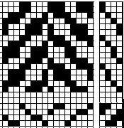
|
||
|
"Rackel" weave from
Lundell: Stora vävboken |
Profile draft from
Stora vävboken |
Herringbone from Cyrus:
Handbok i vävning, fig 39A |
||
|
The colour codes were enormously important. For some weaving teachers it was so important that, when weaving software started to appear, they did not think software would ever be of interest: print-outs were in black and white, which meant one could not understand what they were supposed to represent...
Software versus booksStarting at the modern end, with weaving software: to begin with, everybody said the best feature was that one could get a picture of the cloth. Several softwares were marketed with the colour handling as the primary advantage (one program, if memory serves, was delivered with a standard colour chart, numbers and all, from a big yarn seller). Some programs also had a "cloth view": one could see it draped over a corner of a table. This cloth view has been taken out in later updates.
Nowadays, there are other marketing arguments - "libraries" to use in block substitution is a common example.
|
||||

|
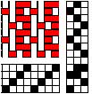
|
I find it much easier to "see" what the grid illustrates.
|
||
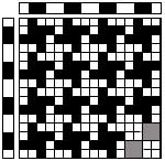
|
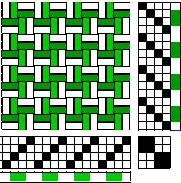
|
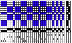
A "colour-and-weave effect" from
Cyrus:Handbok i vävning, figure 218 F.
To the left is what it looks like in the book, to the right in "interlacement view" with colour added. I chose somewhat different greens, because I find it easier to read the draft that way.
|
||
|
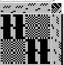
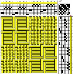
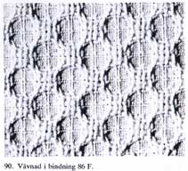
In many softwares you can also change the thread thickness, which also helps. Compare these pictures from Cyrus:Handbok i vävning, figure 86F. The text says (my translation): " should be woven with two yarns with very different grist". This structure will change a lot with wet finishing, as can be seen from the photo. |
||||
|
|
|
||
|
Most weaving software (for handweavers) come from USA or Canada, which means that they, as a standard, follow American traditions. This means that their tie-ups are opposite to what we are accustomed to (rising shed, as opposed to our sinking shed). They also number the shafts and treadles "backwards" - shaft 1 is nearest the weaver, treadle 1 is to the left.
Addendum 2020: nowadays there is a lot more software to be found, some of it made for tablets and other hand-held devices.
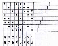
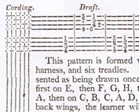
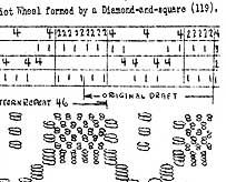
More about different notations in older books, and from some foreign books, can be found here.
|
||||